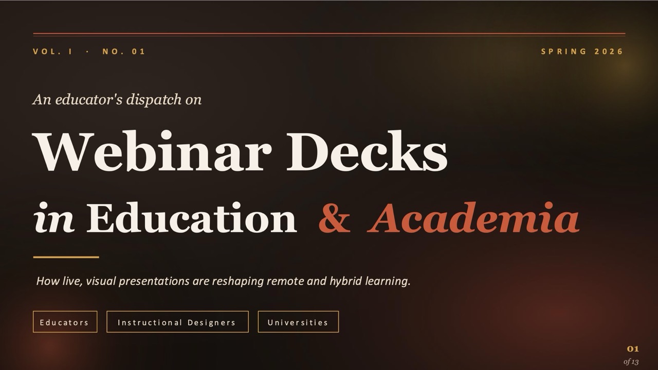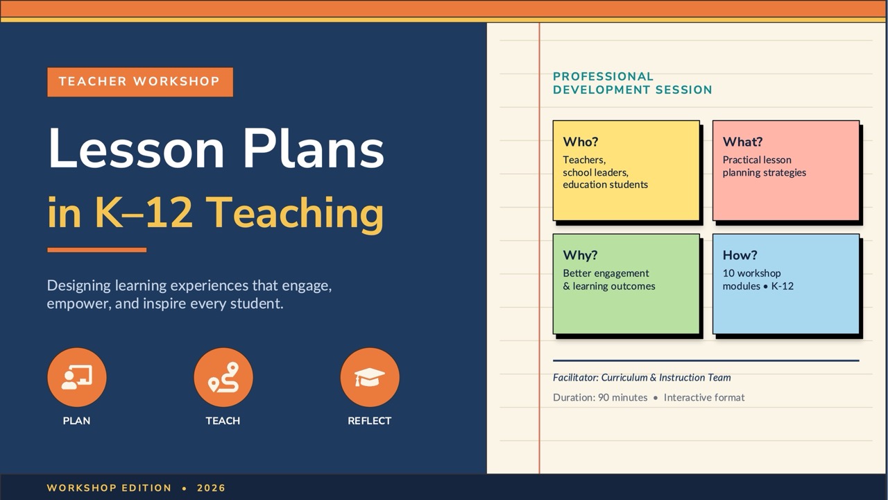

Educational presentations have a constraint that business decks don't: the audience is learning, not deciding. Slides have to support comprehension over time, often in a room where attention competes with notebooks, phones, and tired afternoons. The best educational templates are designed around how people actually absorb new information — chunked content, deliberate repetition, and visual anchors that make abstract ideas concrete.
Designing for learning, not impressing
A common failure is treating educational slides like business slides with friendlier colours. Business decks reward density; educational decks reward space. Each concept needs room to breathe so the audience can finish processing one idea before the next arrives. Templates with single-concept layouts — one diagram, one example, one question — outperform busy multi-column layouts for actual learning outcomes.
The underlying reason is cognitive load. A learner encountering new material is holding several unfamiliar things in working memory at once. Every additional element on the slide competes for that capacity. Slides that pair a spoken explanation with one clear visual land; slides that pair a spoken explanation with dense text force the audience to choose between reading and listening, and they usually do neither well.
Use cases worth distinguishing
Lecture slides, lesson plans, conference talks, and student projects all sit under "educational" but need different layouts. Lecture decks need clear section headers and frequent recap slides because audiences zone in and out. Classroom lessons need interaction prompts — discussion questions, mini-quizzes, "turn to your neighbour" moments. Conference talks need narrative pacing and a strong opening hook because you're competing with three other tracks.
Student presentations have their own rules
A student presentation is doing two things at once: communicating content and demonstrating that the student understands it. The right template depends on the assignment. Research projects need hypothesis, method, results, and conclusion slides. Book reports need character maps and theme sections. History presentations benefit from timeline layouts; science fair decks need experimental setup diagrams and data tables.
Matching the assignment matters more than polish — a beautiful corporate template applied to a fifth-grade book report just makes the report harder to read, while a childish theme undercuts a serious high-school project.
Student presenters are also nervous, reading from notes, and watching the clock. Good templates accommodate that with a clear visual cue that a new section is starting, and a quiet ceiling on how much fits per slide, so the presenter does the talking rather than reading the deck aloud.
What separates a real educational template
Look for typographic clarity at the back of the room. The W3C's minimum contrast criterion is a useful floor even for projected slides, not just web pages. Slides get projected on screens viewed from forty feet away; thin display fonts and pale grey body text disappear. Aim for high contrast and generous minimum type sizes rather than whatever looks elegant on a laptop.
Look for diagrams over decoration. Decks that use iconography to explain cycles, flows, and comparisons help learners build mental models faster than ones leaning on stock photography.
Check the slide dimensions too — Microsoft documents how to change slide size and aspect ratio if a room's projector is still 4:3. Be careful with fonts and animation. A template that depends on licensed fonts will re-render in Calibri on a school computer, breaking every layout — web-safe families survive. And while a build-in animation can usefully reveal a diagram one element at a time, templates that animate every transition train the audience to ignore motion, including the moments that should signal "pay attention."