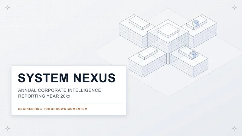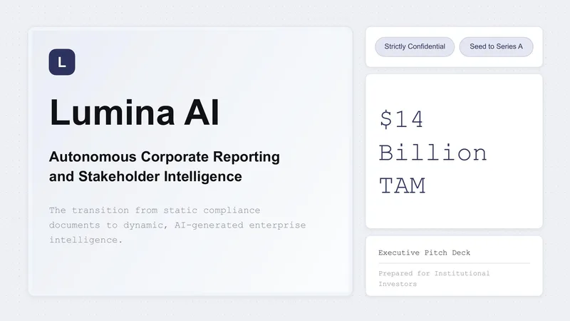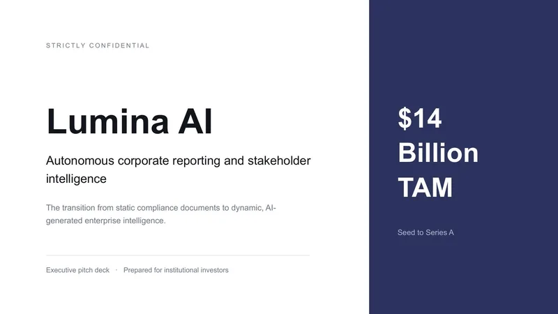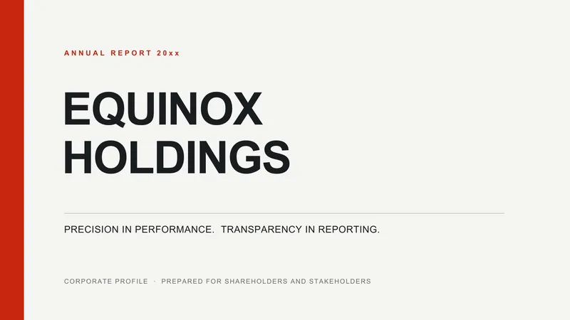

A strong business presentation does one thing well: it moves a decision forward. Whether the deck is for an internal status update, a client proposal, or a quarterly review, the slides exist to support a clear conclusion — not to summarize everything that's happened. Good templates make that easier by giving you opinionated layouts (a problem slide, a recommendation slide, a numbers slide) instead of generic blank canvases.
What to look for in a business template
The best business templates lean on restraint. Single-column layouts beat double-column ones when the audience is reading on a projector or a shared screen. Typography is sober — a single serif or sans-serif family, three sizes maximum, no decorative fonts. Colour is functional rather than decorative: one accent that highlights what matters and neutral fills for everything else. If a template requires you to colour-pick every element to make it look professional, it's the wrong starting point.
Pay close attention to the slide master. Microsoft's own guidance on using slide masters to customise a presentation is worth reading before you commit to a template; click into the master view first — if every layout shares the same margin grid, type scale, and colour palette, you can extend the deck without it drifting. If the cover slide uses fonts and colours that don't exist in the master, you've bought a one-off poster instead of a real system.
Why the slide master decides brand consistency
The hardest problem in corporate presentation design isn't making one slide look good — it's making the marketing team's deck, the finance team's deck, and the CEO's all-hands deck look like they came from the same company. That consistency is enforced almost entirely by the master. When it's set up correctly, a new employee dropping content into a layout produces something on-brand without thinking about it. When it's sloppy, every team gradually goes off-script and your external materials look inconsistent within six months.
This is why a template's value shows up on slide twenty, not slide one. The test for a real business template is whether it still looks coherent after an analyst has stuffed it with content for a Tuesday morning read-out — not how the cover slide looks in the marketplace preview.
Working across PowerPoint, Keynote, and Google Slides
Most teams no longer live in a single tool. A deck gets drafted in PowerPoint, reviewed in Google Slides, and presented from someone's Mac. Google's documentation on opening and converting Office files in Drive is a useful sanity check here. Templates built on web-safe font families survive that round trip; templates built on licensed display fonts do not — they silently fall back to Calibri the moment the file opens on a machine that lacks the font, and the layout you paid for collapses.
The same applies to embedded effects. Shadows, custom gradients, and SmartArt often re-render differently across tools. If a deck has to move between applications, favour templates that achieve their look through layout, type scale, and colour rather than through effects that only one renderer supports.
When to use a business template
Reach for a business presentation template when the audience is senior, time-poor, and skeptical. That covers board meetings, executive read-outs, sales reviews, and most client-facing material. The template should give you slides that don't need explanation — a reader skimming the deck on Slack should still grasp the argument from the slide titles alone.
Common mistakes
Three patterns kill business decks. First, treating bullet points as the entire message; bullets are evidence, not the argument itself. Second, hiding the recommendation on slide twelve when it belongs on slide two — busy executives won't scroll to find your point. Third, reusing the brand intro for every presentation regardless of audience; a board meeting and a sales pitch are different conversations and need different opening slides.
A fourth is subtler: choosing a template whose layouts are too tightly designed. If a slide falls apart the moment you add a fourth bullet or a longer job title, you'll spend the whole project fighting the design instead of using it.